Update: I’ve finally finished the follow-up post. Read the update when you’re all done here!
I have a big week coming up. I’m starting two brand new projects and I’m pitting two top WordPress starter themes against each other in a battle royale:
Underscores
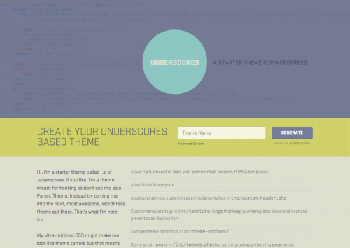
First up, we have Underscores from the Theme Team at Automattic. It is very clean and stripped down, and truly satisfies the ‘starter theme’ criteria. It comes with the barest of necessities, but leaves nothing out at the same time. For you old-schoolers out there, you might notice that a lot of Underscores looks very similar to Toolbox, it’s predecessor. In short: Toolbox was a good starting point for developing themes and Underscores is a great one. Let’s have some pros and cons:
Pros:
- Underscores is familiar. This is really only important to me, but it still matters. I used Toolbox on a lot of projects, and still use my fork of it—Victoria Park—for lots of things today. I used Underscores a few times in the past few months and it really feels like an updated version of what I already like.
- Underscores uses the get_template_part pattern for abstracting template files. I really like this way of thinking about templates.
- Aesthetics matter and the website for the project is great.
Cons:
- Doesn’t use LESS or SASS. This is such an easy issue to fix (rename style.css > style.less and have LiveReload watch the folder) that it hardly warrants a bullet point, but it’s an important distinction from the direction Bones has chosen to take.
- The name. I’ve never really liked the name ‘_s‘, which is an extremely unimportant detail until you go to start a project and have to find and replace all instances of ‘_s’ with ‘my_project_name’. Again, it’s absolutely not a huge deal, but it was a bit of a pain. The pain is now pretty-well completely alleviated by the project’s website—you can now just enter the name of the project and all the finding and replacing will be cleverly done for you.
- Not responsive. I know, I know. You shouldn’t let a project’s boilerplate dictate your media query breakpoints, etc etc…and its something you can (should?) easily add yourself, but I still wish there were a few breakpoints baked in.
- Eric Meyer’s style reset. This one would have been so insignificant a few years ago, but really drives me crazy now. If you’ve ever inspected a single element in Chrome dev tools or Firebug, you’ll know why. Meyer’s style reset, fills your inspector window thusly every time you click on an element:
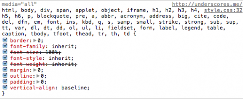
This clutter will show up for every single element you inspect. It’s not a huge deal, and you can remove the style reset and roll your own, but I still wish it wasn’t there to begin with. - Too spartan out of the box. I’ve always found Toolbox and Underscores to be way too spartan from the outset:
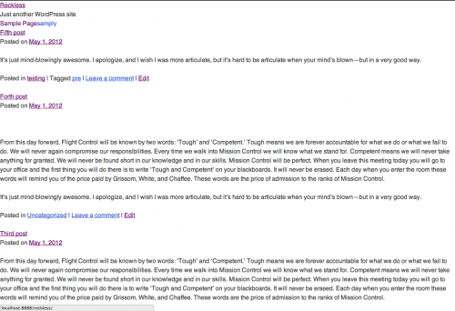
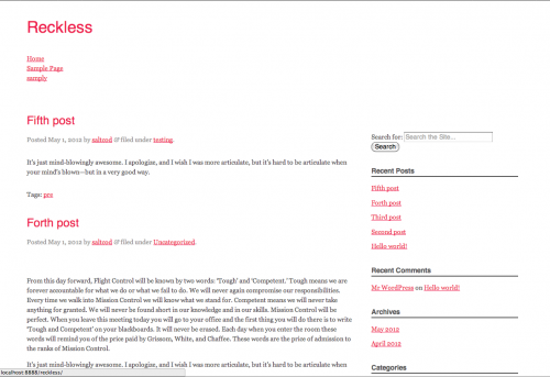
While I understand that this is meant to be just a starting point, I still don’t find it warm and cosy when I start a new project.
Bones
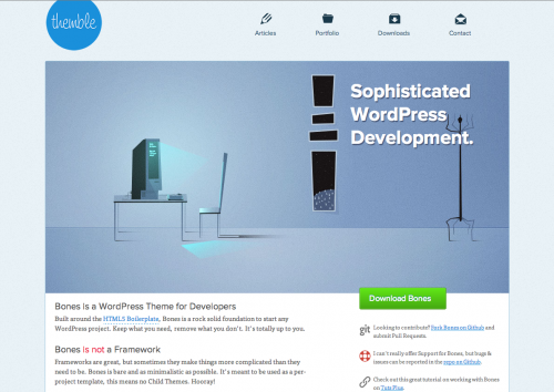
Bones is a hot new theme from Eddie Machado. It’s much more opinionated than Underscores and comes with a few more things under the hood. Before we weigh out the benefits, I need to disclaim up front that I’ve not yet used Bones for a project, so all of the opinions below are just wild speculation. But let’s do it anyway:
Pros:
- Responsive. Bones has a responsive grid baked right in
- Looks good from the get-go Bones isn’t spartan from the start. It has a basic layout ready for you, and overall feels a little better than Underscores does. Sure, you’re still going to undo all of these starting points (the pink headings, etc) but it still feels better to me to start with something out of the box:
- Normalize.css. If you’ve never used Normalize.css from Nicolas Gallagher and Jonathan Neal it’s worth a look. It does the job of resetting quite well, without cluttering up your inspector window.
- LESS/SASS from the start. Here’s where the opinionated part comes in. I love that Bones insists that you should be using a CSS pre-processor (and you should) and makes the two most common options available to you
- Verbose documentation. Some might find this level of documentation to be overkill, but I think it’s going to be helpful to leave it in for at least the first few projects. Machado crams a lot of WordPress know-how into each and every line.
Cons
This is the part where the comparision goes off the rails a bit. Given that this is really a setup post and not a followup, and that I’ve not actually used Bones yet, I can only list a few cons that come to mind when poking through the project’s files and folders
- Modernizr. I don’t use modernizer. At the moment, it feels like this will add unneeded overhead for me. I have no idea. I might use Modernizr for every project henceforth, but for now it feels like it might get in the way
- No get_template_part. Bones doesn’t use the get_template_part pattern, instead loading a lot of functionality into index.php. This doesn’t mean that I can’t do things the way I like, but is still not ideal for me.
- Bones is opinionated. I’m not actually sure yet if this is a pro or a con. Opinionated code is great for beginners and people who have the same ingrained opinions. It will be interesting to see if my Machado and I do things the same way. It will be very interesting to see if I come around to his way of thinking if we don’t!
So there we have it. Underscores and Bones in a tête-à-tête. Results to follow!