Posts Tagged: CSS

Using CSS Preprocessors

Jeff Croft wrote an article today outlining the various ways in which you can process LESS/SASS.

There’s a fair amount of confusion surrounding css preprocessors like Sassand less, and I think some of it has to do with the fact that there are so many different ways you can use them.

Of course he’s 100% right—and it doesn’t need to be confusing at all. When I was first trying this stuff this stuff out, it took me a long time to figure out the ‘best’ way to get my LESS processed into plain-old CSS and get my CSS up to the web server, and thence to the browser. I started compiling it with Javascript at the browser end—but that’s not at all what you want to be doing.

Very simply, here’s precisely what I do with all my WordPress sites:

  1. Write my css to LESS file— called style.less
  2. Use LiveReload to compile it immediately upon hitting save to a style.css file. Every time I hit save, my .css file automatically gets overwritten by the new changes.
  3. I commit both the .less file and the .css file to git and then to Github.

In doing it this way, WordPress never, ever needs to know I’m using LESS. I link to the style.css file in the header as normal, and LiveReload happily serves it up every time I hit save.

Just as easy as that.

Hacker News and my first foray into fluid layouts

I read Hacker News a lot. Its probably become one of my favourite websites in the past few years, and so went to read it over the weekend on my phone I was a bit shocked at what I saw:

Totally unreadable. And there’s really nothing you can do with this page to make it better. Double tapping to zoom in doesn’t help, nor does turning the phone sideways. Manually zooming in on a screen with no set bounds is a disaster too. See:

Here it is double tapped:

Here it is in landscape:

Double tapped landscape:

None of these make reading Hacker News fun, so, disappointed I gave up.

I’ve done a reasonable amount of responsive design work before—making pages respond to set window widths. While this is extremely nifty, its far from fluid. With responsive design, you can use media queries to set defined defaults based on common screen sizes or devices. The bottom of your stylesheet might look something like this:

/* Window widths between 768px and 991px */
@media only screen and (min-width: 768px) and (max-width: 991px) {

	article {
		width: 550px;
		}
}

/* iPhone standard layout: 320px. */

@media only screen and (max-width: 767px) {

	article {
		width: 280px;
	}

}

/* iPhone wide Layout: 480px.  */

@media only screen and (min-width: 480px) and (max-width: 767px) {

	article {
		width: 400px;
	}
}

If you’ve never used media queries before, this is still fairly readable. It simply changes the width of the article element when the window size changes. This works extremely well, but its hardly fluid.

1140px for better mental health

After my sad experience with Hacker News, I was determined to finally figure out this fluid grid thing. A quick googling led me to all the main players (Blueprint, 960, etc) but 1140 struck me as being really simple and straightforward. And it is.

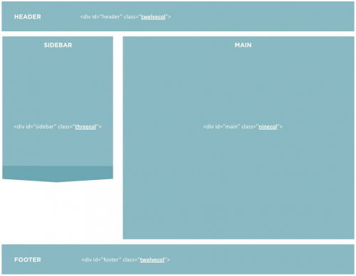
Setting up a layout with 1140px is (mostly) just as easy as this:

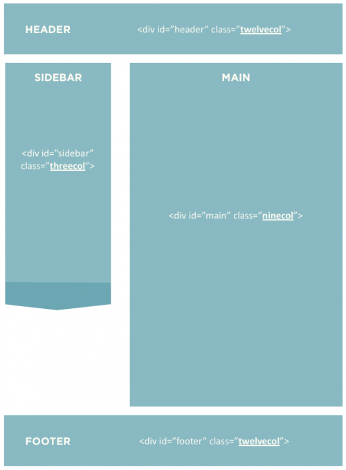
And of course things stay proportional when the browser gets resized:

This certainly doesn’t kill the need for media queries and targeting mobile browser sizes, but at the very least it should provide your users a better viewing experience—at all their browser widths.

If you haven’t yet made the leap from pixels to percents, have a look at 1140. I suspect you’ll be glad you did. I certainly wish/hope Hacker News would.