Posts Tagged: Design

Good enough

Ira Glass has been haunting me for weeks.

I’ve been struggling with a design for a new project for weeks and weeks. It doesn’t really have a lot of images I could use, nor does it have any major typographical element I could make stand out, nor does it have a central hook that I could play with somehow. It just doesn’t have anything jumping out of the page. Yet, I know that if a better designer looked at the scattered piles of material, they’d come up with something amazing. I just know they would. They’d see something I’m not seeing and make it interesting, make it compelling. It would be great by virtue of its starkness if nothing else.

What you’re left with if you haven’t found that compelling angle to run with is something that’s just good enough. What you’re left doing is just gathering up all the content, styling it neatly with a tidy grid, using nice fonts and a nice subtle, tasteful background, with a nicely crafted menu, and then you sit about and secretly loathe it. You haven’t designed anything at this stage: you’ve cobbled something together. Using bits and pieces of your aesthetic and your style, you cobble. But you don’t design.

The same thing that makes something good enough is precisely the same thing that makes it crap. I really wish Ira had spent more time talking about how we get past this.

The case for single-page websites

In the past few weeks, I’ve looked up dozens of local business websites. Almost all follow a similar pattern: including pages for a welcome message, company history, products/services on offer, often sub-pages for each individual product/service, a contact page, and sometimes a company blog.

While some of the homepages I visited look ok, most of the other pages don’t. The strange pattern they all followed was that they almost seemed to run out of gas after they’d come up with the homepage. In almost every case, sub-pages looked like this:

Of course we know that they didn’t run out of gas—they simply ran out of content. All of these sub-pages suffer the same enviable slim-around-the-middle fate, without enough content to expand the beltlines. There’s a better, easier and more effective way: Put it all on a single page.

The best story you’ve ever told, all on a single page

The page above is flat and lifeless. The sidebar continues on forever down the side, the footer just sits there discontentedly, and the actual content looks sad, naked and exposed. Designing for one page forces you to actually think about what you want to say, resulting in a tighter, firmer outward appearance for your clients.

Why do you need those pages anyway?

  1. Contact us—a single line in the header or footer would work just as well. List your phone number and email address, done and done.
  2. Company history—if you’re depending on your company’s history to draw in new business, you’re doing it wrong. Your company is successful and long-lasting because of your great service, committment to customers, and your positive attitute. These core messages belong front and centre on the frontpage, not hidden on a History page that no one will ever read.
  3. Products/Services—unless you’re selling products that I can look at and order online, you don’t need a page for each of them. An accountant, for example, doesn’t need individual pages for bookeeping, personal income tax, corporate income tax, consulting services, etc, etc, etc. You’re an accountant—just put these things in a list under services. If I’m already looking for an accountant’s services, I just need to know if you offer it or not.

The result of a one page site could look something like this:

Even without real content, you can see it looks much better already. It’s all the same stuff you wanted to say before, but now it’s thought out much better and will do a way better job of grabbing attention. The last step is counting the money as it rolls in. Have a look at a few examples to get you going.

Aesthetic: the real craft behind design

Aesthetic is the craft of our profession. I’ve heard some designers say that aesthetic is like the bastard child of design, it’s there but it shouldn’t matter as long as the functionality is solid or the design serves its purpose as a communicative artifact.

These designers are idiots.

This and more in an excellent piece from RetinArt.

Face tomorrow together

When Alexander Fleming discovered Penicillin in 1928, many declared the war against infections and harmful microorganisms to be over. No longer, they thought, would people needlessly die from curable infections now that they had a secret weapon at their sides. But of course it was not to be so. Researchers discovered the first penicillin resistant organisms just a little more than a decade later, and within two decades, resistance to penicillin was widespread. In the five or more decades leading up to today, every single antibiotic that has been produced and consumed by humans has had described cases of resistance. Even the brand new ones; even the really ‘strong’ ones.

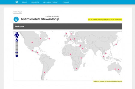
Over at infectionNet we wanted to help do something about this, so we’ve been working hard on a contribution of our own. Yesterday we launched a global inventory of projects that promote proper use of antimicrobials. Our goal over the next few months is to highlight the work of people around the world, give them a voice for their ideas, and applaud them for their efforts in combating a global problem.

Sure, the web is a huge place, and this is just one small corner of it. But that’s where you need to start: small. All of the world’s big ideas started the exact same way.

A guide to hiring developers

Do yourself a favour and google: “St. John’s web design” (obviously, remove St. John’s and insert your own small town). You’ll be surprised with what you see.

When I looked yesterday, I found about 10 local design shops offering web services. Some of them claimed to do “design”, some focused on “database driven” sites, and others focused on niche markets – musicians, BnBs, small volunteer organizations, etc. All of the sites I looked at were table-based, many used inline CSS and at least half of the sites were Flash based. In general, while all of the shops offered something different, they all offered something very much the same – low quality.

If your organization is looking at getting a website developed, you need to ask about things like this:

1. Web Standards

Web Standards are relatively new, under-adhered to, and often thought to be a waste of time. They are not. Ensuring that your site adheres to proper standards ensures that it will be readable on most modern browsers, on most computers and on most smartphones. Further, web standards will make your redesign easier and cheaper in 2-3 years when you look for a new coat of paint.

As has been the official recommendation since 2002, websites [should not](http://www.w3.org/2002/03/csslayout-howto) be made with tables anymore. If your developer is still laying out websites with tables, they have not taken the time to learn how to do it the proper way.

2. Custom CMS

If your developer says that they are going to put your content into a custom CMS that they built themselves, start to run. Run as fast as you can for as long as you can until you are out of harm’s way. A content management system is a broody, complex, and often vengeful animal. If you need software to manage your content, then get a proper, modern CMS. Drupal, WordPress, Joomla!, and Plone are a tiny number of examples of these. I use and recommend Drupal: it’s open source, it’s developed by thousands of developers, is very secure, and is a way better choice than any custom CMS.

3. Do not pay for “search engine optimization” (SEO)

Google has a lot of very bright, hardworking engineers. These men and women work tirelessly to ensure that web content is easily findable. To make your content “findable” on Google, all you need is a modern CMS (see #2 above). The thousands of people who work on Drupal and WordPress know lots about SEO, so you can sleep soundly at night.

The days of adding keywords and metatags to the HEAD section of your website are, thankfully, over. Anyone who tries to charge you for optimizing your Google search results are likely stealing your money.

4. Say no to Flash

My thoughts on Flash are not a secret – I have them well spelled out in several places on this site. Flash used to be the only way to get dynamic (moving) content on the web. It has since become the only way for people who used to make websites in 1998 to continue to make them today without having to re-train. Instead of learning modern tools like HTML and CSS, they continue to build their sites in Flash.

If designed well, very very very few websites need Flash. If you decide to go with Flash, you are signing yourself up for expensive ride. In a Flash site, for example, changing your phone number on the contact page is like changing a single subtitle in a 2 hour movie. You don’t need it.

The web is shifting at lightspeed away from Flash. Just ask Youtube, Vimeo, Apple, or Facebook. Further, there isn’t a single smartphone in the world that Flash currently plays on. Not iPhone, not iPad, not Blackberry, and not Andriod.

Parting thoughts

Even after several years now, the web is still a wild west. If you don’t really know about how the web is put together, then you need to bring questions like these to the first meeting with your potential developer. How they answer questions about web standards, content management, and Flash should tell you lots about what sort of product they will deliver for you. It might take you months to realize it, but asking these questions up front will save you sleep, gray hair, and and certainly truckloads of money in the long run.