It’s been a while since I published Part I of the Bones and Underscores a tête-à-tête. Honestly, I didn’t think writing a follow-up would take half as long as this, and lots of people have been asking what my conclusions are. I’m happy to report that after more than a year, I have reached a conclusion!
[ drumroll ]
I’m delighted to announce that the winner of the Bones vs Underscores death match is: neither / both! (Come on now, you knew there wouldn’t be an actual winner!).
So, on to the details. The reason this post has taken so long to write was that I’m only now realizing what I want to say about both themes. I’ve used _s the most since it came out — I’ve probably built 10+ themes with it as the foundation — and so it was really hard to judge Bones against that after just some light playing around. In the last few months, I’ve gotten to build a few new projects with Bones (this site is one), and I’m in a much better position to give some honest feedback about what I think of them both. Let’s get to it!
Bones
Mobile first
When I first started playing with Bones, I didn’t know what to make of the whole mobile first thing. It was my introduction to this design approach, and was much different than the typical pattern of throwing rules at media queries in the bottom of style.css and calling a site responsive. Mobile first really forces you to think about the most basic elements of your site and build up from there.
With Bones, you start with the _base.less file (if you use LESS), and build up. An easy way to think about it is to think of _base.less the same way that you would think of your typical smallest media query. So, anything you would put in that media query to affect the look of your site on phones should go in that file. When you’ve got that roughly the way you want it, you move on to the next size up: the _768up.less file. This will affect screens from 768px wide and up. Anything you want to have happen on an iPad or a desktop or a laptop, you put in here. If you’re used to tackling media queries at the end of a project, it will probably feel a bit painful to have to think about phones and laptops separately, but once you’ve spent a few hours in this mindset, it quickly becomes natural.
Even if you have no intention of ever using Bones, I’d still recommend building a site using it, just to get the benefit of being exposed to the mobile first idea. Mobile first seemed so unnecessary and almost pretentious to me last year, but now it feels 100% the right way to do things.
The big piece of getting this was realizing that mobile first refers to the process not the product. I used to think: “Meh. Only 20% of my visitors are on mobile, so why should I start with them first?”. But it’s really about thinking of the mobile part as a foundation — start with small screens and lay out all the foundational elements — colours, type, visual elements, etc — and then layer on top of that. Only add what you need as the screen size changes. It doesn’t mean designing a fully-functioning iPhone site before even thinking about your desktop site — it means only adding or layering on the bare minimum to each successive size up. If you’ve laid a solid foundation in your _base.less file, you’ll likely have add very minimally to the other screen sizes. In short: mobile-first doesn’t mean extra work.
End tangent. That was a lot more about mobile first than Bones specifically, but it was huge, huge, huge for me. Hopefully it will be a good introduction to mobile first for you as well.
Stylesheet partials
Being a fan of _s for so long (and it’s predecessor, Toolbox, for longer) I’d grown accustomed to having just one stylesheet to manage— style.less — the one-stop-shop. I loved the simplicity, I loved having everything in one place. It was great. Until I saw a better way. Bones has everything broken out into partials — there’s a partial for the base styles, another for each media query breakpoint (480, 768, 1030, 1240) as well as others for retina screens, one for normalize.css, one for print styles, one for mixins, one for the grid, etc. IE: lots of partials.
I really found this unnecessary and inefficient at first. I had to search around to see where everything was, and I was never sure if I was putting things in the right place. To be honest, it was pretty frustrating. But slowly, over time, I began to see the natural breakdown of styles. I started to get the whole mobile first thing and I swapped in my own grid system and added some of my own mixins, and pretty soon I was actually thinking in partials. It just started to make sense to have things in different files, separated by the things that concern them.
get_template_part()
As of this writing, Bones still doesn’t implement the get_template_part() design pattern that I love so much. I really hate overloaded template files, and so I simply had to change that if I was going to continue working with Bones. In the end, I took that approach from _s and morphed it into my fork of Bones. The result is much lighter template files, and a bit of reduced repetition. It might not bother you, but it was a real deal-breaker for me.
Underscores
The name
I hate the name. Having to do a complicated search and replace for the string _s has never once worked out properly for me, and so in all my old projects I’ve just left references to _s, rather than try and weed them all out. It’s probably a minor issue, but it’s been really frustrating every time I’ve gone to use it. I’m always left scratching my head, thinking “_s”? Is this the best they could come up with?
The barebones-ness
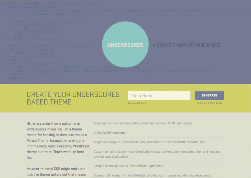
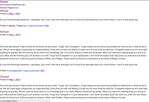
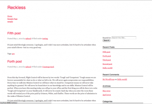
Underscores is very, very bare when you get it installed and activated. In fact, every time I activate it and go to the front page, my immediate reaction is to think that there’s something going on with my MAMP install. It’s completely bare. It does come supplied with some sample layouts, but really, if you’re starting from absolute scratch like this, you’re probably going to build your own layouts too.
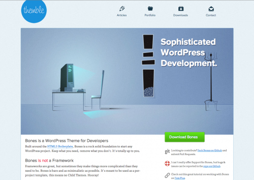
Although any visual styling would probably need to be undone as you setup your new project, I still think it would make the starting point feel a bit more comfortable. Maybe it’s just the designer in me, but I always find starting a new project in Bones to be much more comfort/ing/able. I like to start with something, even if that something needs to eventually be removed. That’s just me.
But you may love it. It’s a completely clean slate, with almost no assumptions made about how it should look. That might be just what you’re happiest with.
The Buttons
The button styles are grotesque. There’s no way around those giant, hideous buttons.
Eric Meyer’s style reset
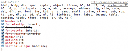
I mentioned in the original post that I really don’t like Eric Meyer’s stylesheet reset that Underscores uses. I still don’t. I prefer the normalize approach from Nicolas Gallagher, as used by Bones. Seeing my dev tools inspector window filled with line after line of needless resets just really frustrates me. There’s no need anymore.
The rest
That said, the rest of this theme is fantastic. Everything being done in this theme is being done for the right reasons and with good justifications. It’s been used and refined by all kinds of very smart developers who know WordPress inside out, so I really trust what’s going on in the template files. If you’re looking for the Right Way to develop a WordPress theme from scratch, I’d say to start there, without hesitation.
In short
You’ve probably guessed by now that I’m in the process of creating a Bones / Underscores Franken-hybrid theme. There’s just so much I love and hate with each one, that it seems natural to customize the best of both and make the perfect theme for me. I’ve started down that road here: Waterstreet on Github. You’re more than welcome to have a look and see how I’ve got things setup. A few things you might notice right away:
- I’m pulling in content.php via get_template_part() wherever possible.
- I’ve got Font Awesome hooked in and ready to go.
- I’m using a grid inspired by the great work over at Mapbox
- I’m using many of Underscore’s template tags
I’m still wondering if I should have forked Underscores added Bones, or forked Bones and added Underscores, but time will tell. At the moment, I’m fairly happy with the direction of our Franken-hybrid. Stay tuned!
