The latest Crome Canary comes with a few minor tweaks to search interface. The missing search bar being the most notable.
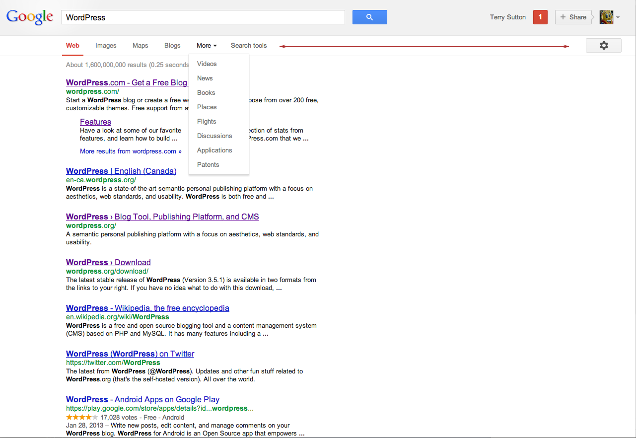
The most interesting thing for me is the search menu (Web, Images, Maps, and eventually, More). It’s interesting because there’s room on that bar to fit more (between “Search tools” and the gear icon way over to the right) , but Google has opted for sparseness and hidden all the rest in a menu item.
There’s so much room for less in everything we design. Let’s avail of it.