I had a discussion the other day about ideal line length for reading content. I’ve got an ideal number in my head, but I wondered if there was any consensus out there on how long lines should be. With so many sites going responsive these days, there’s a tendency to let the max-width on the content container be huge — often upwards of 1200px. That’s just way too wide for me. On sites that do that, I’ll normally resize my browser window to pull things together a bit better. Seems to matter less for others, and some research is indicating that it matters less online overall.
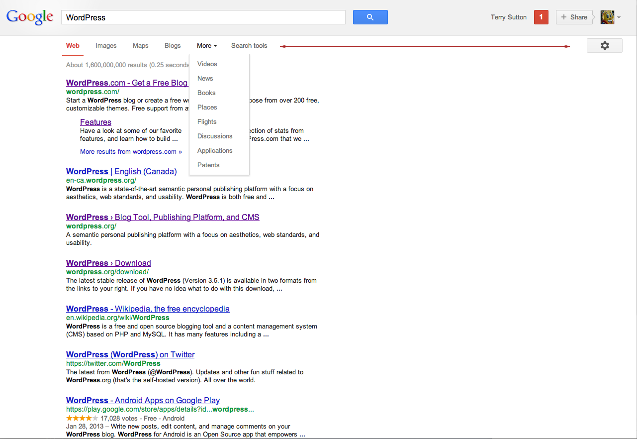
It certainly matters to me! Google “ideal line length” to find more than you’ve ever wanted to read on the subject.
Out of curiosity, I went to some of the sites I visit with some regularity. Here’s what I found:
- The Independent — 460px
- A List Apart — 960px
- The Globe and Mail — 460px
- New York Times — 540px
- CBC News — 460px
- Facebook — 470px
- ESPN — 580px
- StackOverflow — 665px
- Medium — 700px
- CSS-Tricks — 786px
Seems that at least the news sites are in alignment with where I like things to be.

