Posts Tagged: WordPress

Advice for front-end developers for 2015

People who know me in the non-internet world, know that I’m prone to giving advice. I try and do it gently, and I always try to make sure I’m not preaching. My wife will absolutely disagree with that last sentence, but what do you do? The simple fact is when I find something I like, I tend to really like it and want to show everyone around me how awesome it is.

I have just two pieces of advice for front-end developers in this brand new year:

1. If you’re not already using Sass, start.

If you’re still writing plain-old css, make 2015 the year that you make the switch. If you’re using less, switch from that to Sass. This is 100% my opinion, and I mean absolutely no disrespect to the less team, but Sass really feels much, much better to me at this moment in time.

I give this advice as a long, long time writer of styles. I was actually (relatively) late to the pre-processing party, seeing it as more trouble than it was worth for a long time. When I finally saw the light and found a simple tool to do my preprocessing for me, I happened to choose less. I have no idea why now that I look back on it. Maybe it was because less was Javascript and Sass was Ruby and so it seemed easier to get started with, but no idea really. In any case, I was a preprocessing convert in literally minutes. Almost instantly, writing vanilla css seemed like a chore.

As a long-time less user, why do I recommend Sass now? I’ve really only been using Sass for just shy of a year, after several years of being quite happy with less. I actually tried Sass several times in those years, but really couldn’t see the benefit. It wasn’t until I realized that everyone I knew and followed online was using Sass that I forced myself to switch to see if I was missing out on anything. Turns out I was.

I was missing out on these 2 major things:   community and breakpoints or “named media queries”. First, in short, the Sass community is awesome and active. Have a look through The Sass Way for many examples of this. Second, breakpoints are amazing. It will change the way you write and think about media queries.

2. Start using Grunt. 

I know, I know. Grunt is weird and hard, even though Chris Coyier told you it isn’t. You still find it too developer-y, or too finicky, or too much effort than you have time for, or all kinds of other legitimate reasons. I completely understand. I tried to “get” Grunt for a long time before it finally clicked for me. But now, after just a few months, I’m quite comfortable with Grunt and hate working on projects without it.

My best advice for getting started with Grunt is this: just get it to compile your Sass for you. No more than that. Don’t worry about compiling Javascript, or minifying  or uglifying or anything else for the time being. Just get Grunt to watch and compile your Sass for you as you write it and get comfortable. If you follow that 24ways post, you shouldn’t have too much trouble getting going. If you get errors just google them and work through it. I swear it will pay off in the end. If you’re a WordPress theme developer, I’d strongly, strongly recommend using 10up’s Grunt starter theme. It’s extremely bare bones (you’ll see what I mean when you install it), but it will give you a great example of how to set things up when you get a little more familiar with Grunt. Combine the barebones setup with templates from Underscores, and you’ll be a theme master in no time.

Why? 

I was happily writing css with less for years, and before Grunt I was very happily using LiveReload to compile it for me. But Sass and Grunt are much more than a replacement for these things — they’ve opened me up to so many more tools and workflows and best practices that I didn’t even think about when I started. The Grunt ecosystem is massive — filled to the brim with useful tools for so many things that you’d want to do. But until you start to use Grunt in even a basic way (like compiling Sass), you’ll never be exposed to any of it.

These days, I use Grunt for all kinds of things: processing and minifying Sass and Javascript, making sprite maps, cross-browser testing, highlighting unused css rules, minifying images, and much more. It will become an essential tool once you get over the initial hurdle.

I’ve been pretty shy on details here because a post like this could almost turn into a book if I started going through examples and how-tos, so I’ll just end it here. I wish I’d read exactly this advice on January 1st 2014 or earlier.

ps: #1 Like most people, I actually use the scss syntax.  #2 I have no idea if it’s SASS or sass or Sass / LESS or less or Less.
Wrestling with the WordPress Toolbar

Of all things WordPress that I do, dealing with the Toolbar has to be the most tedious. I’m never happy with the defaults (Themes, Widgets, Plugins, etc…). I only typically use those during site setup. Here’s a dead simple tidy-up that should serve you and your clients.

 
**
 * Clean up and add items to the Toolbar
 *
 */


function waterstreet_remove_admin_bar_items( $wp_admin_bar ) {
	$wp_admin_bar->remove_node( 'themes' );
	$wp_admin_bar->remove_node( 'menus' );
	$wp_admin_bar->remove_node( 'customize' );
	$wp_admin_bar->remove_node( 'widgets' );
	$wp_admin_bar->remove_node( 'background' );
}
add_action( 'admin_bar_menu', 'waterstreet_remove_admin_bar_items', 999 );


function waterstreet_add_admin_bar_items( $wp_admin_bar ) {
	$args = array(
		'id'    => 'pages',
		'title' => 'Pages',
		'href'  => site_url(). '/wp-admin/edit.php?post_type=page',
		'parent' => 'site-name',
		'meta'  => array( 'class' => 'all-pages' )
		);
	$wp_admin_bar->add_node( $args );
}
add_action( 'admin_bar_menu', 'waterstreet_add_admin_bar_items', 999 );


That first function waterstreet_remove_admin_bar_items works just as you’d expect — it removes items from the main “site-name” dropdown. The second function adds back the items you want.

If you have more than one item, you can just put one after the other in the function:


function waterstreet_add_admin_bar_items( $wp_admin_bar ) {
	$args = array(
		'id'    => 'pages',
		'title' => 'Pages',
		'href'  => site_url(). '/wp-admin/edit.php?post_type=page',
		'parent' => 'site-name',
		'meta'  => array( 'class' => 'all-pages' )
		);
	$wp_admin_bar->add_node( $args );

	$args = array(
		'id'    => 'posts',
		'title' => 'All my Posts',
		'href'  => site_url(). '/wp-admin/edit.php',
		'parent' => 'site-name',
		'meta'  => array( 'class' => 'all-posts' )
		);
	$wp_admin_bar->add_node( $args );


}
add_action( 'admin_bar_menu', 'waterstreet_add_admin_bar_items', 999 );

Surviving a HackerNews traffic spike on a $5/mo host

The two alternate titles of this post are Everything I know about running your own VPS or Host a pile of your high-traffic WordPress sites for just $5/mo, but let’s go with what we have.

A few months back, after scrolling over enough promoted tweets from Digital Ocean in my timeline, I got curious enough to spend the $5 for the basic plan and sign up. At that point I was simply interested in seeing what they had to offer — see what their interface was like, see what WordPress felt like on an SSD, etc. I certainly wasn’t intending on spending hours and hours tuning and tweaking and configuring, but yet that’s exactly what I did.

Surviving a Hacker News spike

When Throwing in the Towel on Programming hit Hacker News, I was at home cooking supper and playing with Jack. I happened to check in on the traffic about half-way through the spike and could see that things were humming along perfectly well. In the end, I had almost 10k visits in the span of less than 2 hours. Not huge traffic by any stretch, but more than most small blogs like this get in the run of a few hours. In the time since, I’ve done all kinds of additional tweaking and tuning, and I think at this point I could serve much much more traffic without the server breaking a sweat.

But that’s the end of the story. Let’s start at the beginning!

Setting up your new VPS

I chose Digital Ocean (DO) because of that enticing $5 gateway. You could absolutely go with Linode as well — I have no preference and have used and liked both. Here’s what I did at DO:

  1. Install Ubuntu (12.04 in my case)
  2. Install the lamp stack I need to run WordPress
  3. Setup my dotfiles
  4. Install wpcli
  5. Setup a new virtual host for a WordPress site
  6. Install WordPress! (though I did this mostly through wpcli
  7. Profit!

And basically that was it, all except for step #7. Turns out that even on a fresh server install on a blazing fast SSD, things were moving extremely slowly. I was trying to import some .xml export files from some of my sites and MySQL kept falling over and needing to be restarted, and things generally were not going well. It made no sense to me — I had a brand new setup, on a very fast hard drive but my one single site was just crawling along. That’s when I hit #digitalocean on Freenode to get some help.

The good folks in #digitalocean were extremely friendly and helpful. Not all IRC channels are friendly to beginners—that’s an understatement—but DO’s certainly was. They helped me with my initial setup and are still helping me today with the more complicated stuff I run into. Before hitting a wall and giving up, you should definitely head over there and start asking for help.

Tweak and Tune

After a considerable amount of time spent reading and asking questions on IRC, I had a good sense of what I needed to do to make my server perform. Here’s roughly what I did:

  1. Tune Apache
  2. No, I mean, really tune Apache
  3. Spend an entire day reading about KeepAlive
  4. Keep reading about KeepAlive
  5. Tune MySQL
  6. Loose sleep over setting the ideal key_buffer_size
  7. Install MySQLTuner (you should let MySQL run for 24hrs or more before acting on the recommendations this gives you

After I went through all of this, performance really picked up. MySQL wasn’t falling over while doing relatively simple tasks, and things were generally much much faster. But how fast? How could I tell that everything was performing better?

Tools of the Trade

The hardest part of the learning curve to running your own VPS is getting a handle on the tools you have available to you. Understanding how much memory you have and how much you’re using at any one time is the big one, and that took me a while to catch on to. Basically there’s two main commands/tools that you’ll want to keep an eye on. Every morning when I get into work, I’ll open up two terminal windows and run two commands to see how things are doing:

1. top 

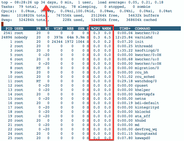
Just log in to your VPS and run the command ‘top’. That should fill your screen with a whole pile of info. Everything from how long your server has been “up”, how much memory you’re using, what processes are running and what % of CPU power they’re using. I like to sort the processes by %CPU or %MEM — do that by typing Shift+O then either n or k.

Here’s what that looks like :

top

2. free -m

Top gives you a sense of how much memory you’re using at any one time, but keeping an eye on free is a better way. Just type that into your terminal and see the how much memory you’re using. The output looks like this:

free-m

The line you’ll want to look at here is the second one:
-/+ buffers/cache:        339        655

This is telling me that I’m currently using 339MB of memory and have 655MB free. I’ve recently upgraded to the $10 plan, so that’s why I have 1024MB (1GB) of memory and not 512MB. But that’s what you’ll want to look at. Of course you’re not going to want to have to keep typing that free -m command every time you want to see how much memory you’re using, so you should watch it instead:

watch -n 10 free -m
That will run this command for you every 10 seconds.

Ok, so let’s recap where we are. We’ve got a lamp stack installed on Ubuntu, created a virtual host, got WordPress installed, and we’ve got Apache and MySQL all tuned up and ready for another Hacker News spike. The only thing is, how do we know we’re ready? How do we test that everything we’ve done has helped? I’m still struggling with this part a little myself, but I’ve come up with a few strategies.

Load Testing

I use two tools for testing:

Apache Bench

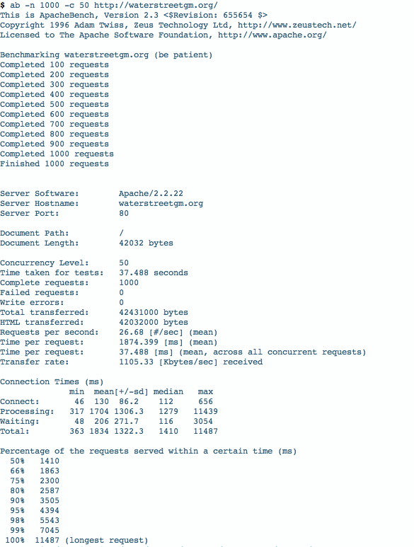
This is a system tool that will let you send traffic from your desktop to your server. To use it, logout of your VPS and try sending some requests along. I use something like this:

ab -n 1000 -c 50 http://waterstreetgm.org/

This simulates requests (1000) and concurrent users (50) to your site. The output looks like this:

apache-bench

That’s a lot of information there. A few key lines to look at are your Request per second and the percentages at the bottom. The 50% 1410 is telling me that 50% of the 1000 requests were served to my visitors in less than 1.4s, which isn’t too bad. I’d like to get the mean time per request down a little lower (1874ms or 1.8s) but it’s still pretty good.

Blitz.io

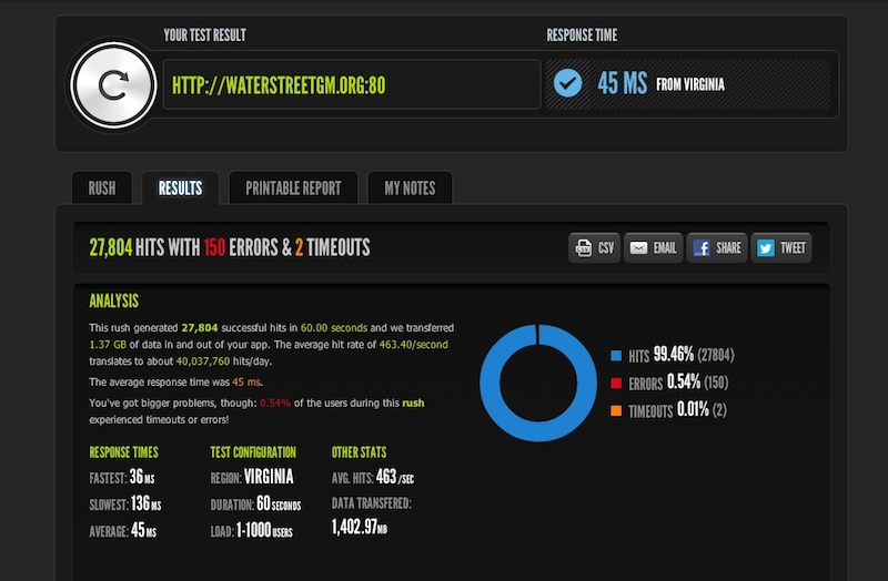
Blitz is an extremely neat tool. This does a more real-world benchmark than Apache Bench does. It rushes your site with traffic and gives you a report of how you did. My report currently looks like this:

blitz

Blitz is suggesting that I survived 463 hits/s, and that my site could handle 40M hits/day (!), which seems a bit insane to me. That said, this one rush sent 27,804 hits to my site in 60s and I handled that no sweat, so maybe I could handle 40M visits per day.

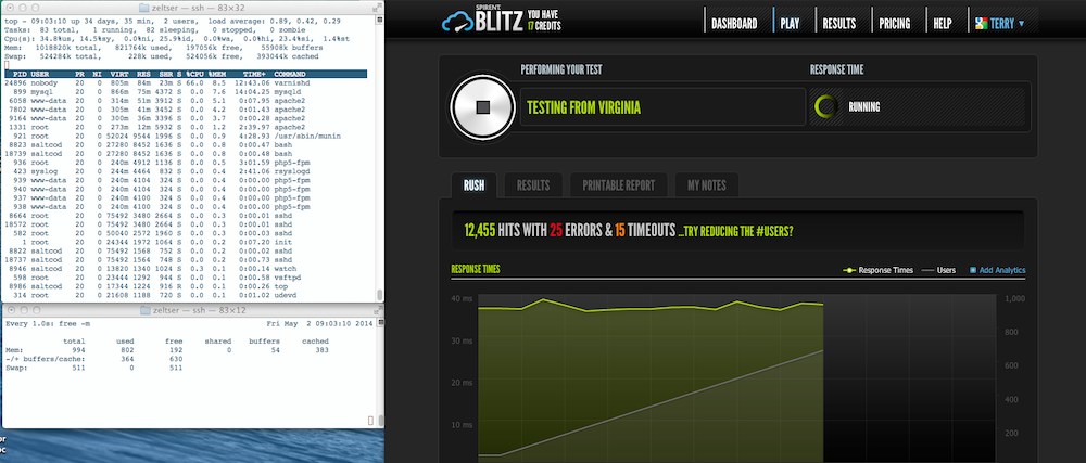
How do I know it was no sweat? While running this Blitz, I have two terminal windows open running free -m and top so I can see what’s happening. Here’s what that looked like during this rush:

blitz-top-free

It’s a little hard to see the output in the terminal windows there, but the top CPU-consuming application during this blitz was Varnish, and on the bottom you can see that during all this I was still only using around 364MB of memory—I noticed virtually no spike in memory use during this test. That’s pretty neat. I’m also this close to scrapping the Apache setup altogether and taking Nginx for a spin—but that’s a conversation for another day.

Oh yeah, I installed Varnish here too, forgot to mention that! Honestly, at this stage, I still don’t know enough about Varnish to comment on the performance gain. I know it’s supposed to be a magic unicorn for managing traffic, but I don’t know too much about it yet. What I do know is that when I finally got Varnish setup and running properly, I tailed my mysql log and did the Apache Bench and Blitz testing and found that there were no (zero!) requests going to MySQL. Whether that has to do with WP Super Cache or Varnish, I’m honestly not sure. I hope to read much more about this in the coming weeks.

And that’s about it! With a finely tuned lamp stack, you really can serve a huge pile of traffic from just a 512MB, $5 VPS. It will take some time and effort, but you’ll learn a ton along the way. I will point out one caveat with this though: the need for speed is addictive. I started out just wanting to see what Digital Ocean was like a month later I’m editing a Varnish vcl file and sweating page load times over 500ms. But the good news is that it’s actually a lot of fun along the way. Enjoy!

Bones and Underscores — WordPress theme head-to-head Update

wp-theme-shootout

It’s been a while since I published Part I of the Bones and Underscores a tête-à-tête. Honestly, I didn’t think writing a follow-up would take half as long as this, and lots of people have been asking what my conclusions are. I’m happy to report that after more than a year, I have reached a conclusion!

[ drumroll ]

I’m delighted to announce that the winner of the Bones vs Underscores death match is: neither / both! (Come on now, you knew there wouldn’t be an actual winner!).

So, on to the details. The reason this post has taken so long to write was that I’m only now realizing what I want to say about both themes. I’ve used _s the most since it came out — I’ve probably built 10+ themes with it as the foundation — and so it was really hard to judge Bones against that after just some light playing around. In the last few months, I’ve gotten to build a few new projects with Bones (this site is one), and I’m in a much better position to give some honest feedback about what I think of them both. Let’s get to it!

Bones

Mobile first

When I first started playing with Bones, I didn’t know what to make of the whole mobile first thing. It was my introduction to this design approach, and was much different than the typical pattern of throwing rules at media queries in the bottom of style.css and calling a site responsive. Mobile first really forces you to think about the most basic elements of your site and build up from there.

With Bones, you start with the _base.less file (if you use LESS), and build up. An easy way to think about it is to think of _base.less the same way that you would think of your typical smallest media query. So, anything you would put in that media query to affect the look of your site on phones should go in that file. When you’ve got that roughly the way you want it, you move on to the next size up: the _768up.less file. This will affect screens from 768px wide and up. Anything you want to have happen on an iPad or a desktop or a laptop, you put in here. If you’re used to tackling media queries at the end of a project, it will probably feel a bit painful to have to think about phones and laptops separately, but once you’ve spent a few hours in this mindset, it quickly becomes natural.

Even if you have no intention of ever using Bones, I’d still recommend building a site using it, just to get the benefit of being exposed to the mobile first idea. Mobile first seemed so unnecessary and almost pretentious to me last year, but now it feels 100% the right way to do things.

The big piece of getting this was realizing that mobile first refers to the process not the product. I used to think: “Meh. Only 20% of my visitors are on mobile, so why should I start with them first?”. But it’s really about thinking of the mobile part as a foundation — start with small screens and lay out all the foundational elements — colours, type, visual elements, etc — and then layer on top of that. Only add what you need as the screen size changes. It doesn’t mean designing a fully-functioning iPhone site before even thinking about your desktop site — it means only adding or layering on the bare minimum to each successive size up. If you’ve laid a solid foundation in your _base.less file, you’ll likely have add very minimally to the other screen sizes. In short: mobile-first doesn’t mean extra work.

End tangent. That was a lot more about mobile first than Bones specifically, but it was huge, huge, huge for me. Hopefully it will be a good introduction to mobile first for you as well.

Stylesheet partials

Being a fan of _s for so long (and it’s predecessor, Toolbox, for longer) I’d grown accustomed to having just one stylesheet to manage— style.less — the one-stop-shop. I loved the simplicity, I loved having everything in one place. It was great. Until I saw a better way. Bones has everything broken out into partials — there’s a partial for the base styles, another for each media query breakpoint (480, 768, 1030, 1240) as well as others for retina screens, one for normalize.css, one for print styles, one for mixins, one for the grid, etc. IE: lots of partials.

I really found this unnecessary and inefficient at first. I had to search around to see where everything was, and I was never sure if I was putting things in the right place. To be honest, it was pretty frustrating. But slowly, over time, I began to see the natural breakdown of styles. I started to get the whole mobile first thing and I swapped in my own grid system and added some of my own mixins, and pretty soon I was actually thinking in partials. It just started to make sense to have things in different files, separated by the things that concern them.

 get_template_part()

As of this writing, Bones still doesn’t implement the get_template_part() design pattern that I love so much. I really hate overloaded template files, and so I simply had to change that if I was going to continue working with Bones. In the end, I took that approach from _s and morphed it into my fork of Bones. The result is much lighter template files, and a bit of reduced repetition. It might not bother you, but it was a real deal-breaker for me.

Underscores

The name

I hate the name. Having to do a complicated search and replace for the string _s has never once worked out properly for me, and so in all my old projects I’ve just left references to _s, rather than try and weed them all out. It’s probably a minor issue, but it’s been really frustrating every time I’ve gone to use it. I’m always left scratching my head, thinking “_s”? Is this the best they could come up with?

The barebones-ness

Underscores is very, very bare when you get it installed and activated. In fact, every time I activate it and go to the front page, my immediate reaction is to think that there’s something going on with my MAMP install. It’s completely bare. It does come supplied with some sample layouts, but really, if you’re starting from absolute scratch like this, you’re probably going to build your own layouts too.

Although any visual styling would probably need to be undone as you setup your new project, I still think it would make the starting point feel a bit more comfortable. Maybe it’s just the designer in me, but I always find starting a new project in Bones to be much more comfort/ing/able. I like to start with something, even if that something needs to eventually be removed. That’s just me.

But you may love it. It’s a completely clean slate, with almost no assumptions made about how it should look. That might be just what you’re happiest with.

The Buttons

The button styles are grotesque. There’s no way around those giant, hideous buttons.

Eric Meyer’s style reset

I mentioned in the original post that I really don’t like Eric Meyer’s stylesheet reset that Underscores uses. I still don’t. I prefer the normalize approach from Nicolas Gallagher, as used by Bones. Seeing my dev tools inspector window filled with line after line of needless resets just really frustrates me. There’s no need anymore.

The rest

That said, the rest of this theme is fantastic. Everything being done in this theme is being done for the right reasons and with good justifications. It’s been used and refined by all kinds of very smart developers who know WordPress inside out, so I really trust what’s going on in the template files. If you’re looking for the Right Way to develop a WordPress theme from scratch, I’d say to start there, without hesitation.

In short

You’ve probably guessed by now that I’m in the process of creating a Bones / Underscores Franken-hybrid theme. There’s just so much I love and hate with each one, that it seems natural to customize the best of both and make the perfect theme for me. I’ve started down that road here: Waterstreet on Github. You’re more than welcome to have a look and see how I’ve got things setup. A few things you might notice right away:

  1. I’m pulling in content.php via get_template_part() wherever possible.
  2. I’ve got Font Awesome hooked in and ready to go.
  3. I’m using a grid inspired by the great work over at Mapbox
  4. I’m using many of Underscore’s template tags

I’m still wondering if I should have forked Underscores added Bones, or forked Bones and added Underscores, but time will tell. At the moment, I’m fairly happy with the direction of our Franken-hybrid. Stay tuned!

A Ghost is Born

Ghost opened to the public yesterday—on Canadian Thanksgiving Monday, no less!— so I naturally downloaded it and gave it a spin.

It’s been available to Kickstarter backers for a few weeks now (or months?) so there’s lots of press out there already. Almost all of the stuff I’ve read has been overwhelmingly positive, and for good reason. Ghost is already a well packaged product: the branding, the marketing, the single-minded vision (to be a blog), to say nothing of the software itself (it looks great).

I read a great piece from Michael Bastos yesterday talking about the intersection of WordPress and Ghost. He does a great job of outlining where both are in the market and where they’re likely to collide and/or benefit from each other. I agree with almost all of what he says. But while using Ghost yesterday for the first time, I wasn’t struck by how full-featured it was, or how it could develop into a “WordPress killer” as some are saying. What I was struck by was something unexpected.

I was struck by the speed and responsiveness. Having Javascript at its core, I was certainly expecting Ghost to feel somehow different, I just wasn’t sure how. But after a few clicks around the admin area, it felt wildly different than anything else I’ve used. Pages loaded instantly when you clicked. No waiting, no progress bar, nothing. Just click and then there’s the page — instantly.

Going back to a WordPress project after playing with Ghost for a half-hour or so, felt like I was taking a real step backwards. I could feel the WordPress pages loading. I’d click a menu item and wait a noticeable amount of time before the page loaded. It wasn’t unbearable or sluggish by any means, but it really was different. Of course I understand that a page load in WordPress involves much more than one in Ghost, and that their underlying technologies are very, very different, but still.

The whole time I was playing with Ghost yesterday, it felt that this was where WordPress could stand to benefit most. As more and more of WordPress slowly morphs into Javascript, we’ll eventually get to a stage where WordPress behaves this quickly and responsively. This is what makes working with WordPress that much more exciting.